This case study showcases WyePay, a banking app designed to help users manage money, transfer funds, and access account features without visiting a branch. The design applies user-centered principles to create an intuitive and accessible experience.
Project Overview
WyePay is a digital banking app designed to simplify everyday financial tasks such as transferring money, checking balances, and tracking payments. The goal was to create a fast, intuitive, and accessible app that reduces the need to visit a physical bank.
Problem Statement
Users often find banking apps frustrating and inconvenient. They want quick, reliable access to core features while maintaining security and ease of use.
Target Audience: Adults 18–45 who are tech-savvy, value speed, transparency, and mobile access for financial management.
Role:
UX Designer (Responsible for user research, wireframing, prototyping, visual design, and usability testing)
Timeframe:
October 2024 – February 2025
Deliverables:
User research, personas, journey maps, wireframes, prototypes, usability testing, and final UI design
Tools:
Figma
Research Process
A step-by-step approach to understanding users, defining challenges, and shaping WyePay’s design solutions.
Empathize
Discovering user needs and behaviors
Define
Framing the problem and goals
Ideate
Exploring solutions through brainstorming
Prototype & Test
Bringing ideas to life and validating them
Empathize
Gathered user insights through surveys to uncover frustrations with existing banking apps.
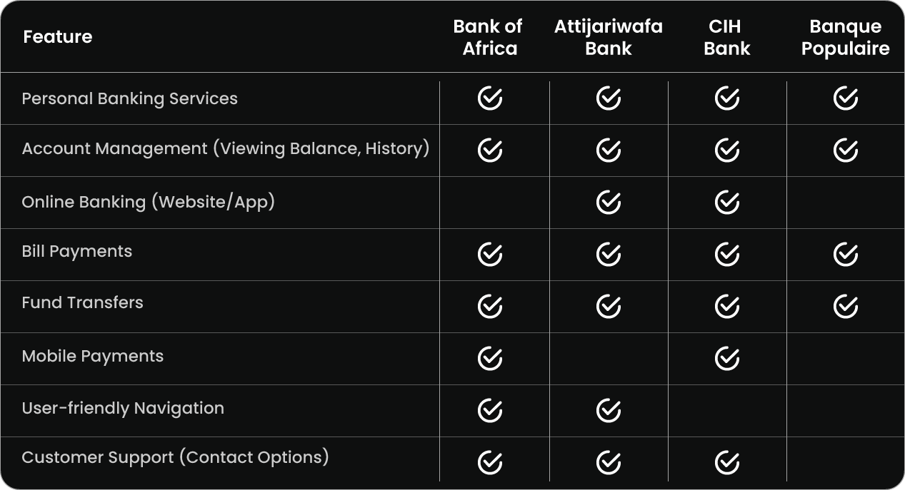
To understand the market, a competitive audit of major Moroccan banks revealed gaps in usability and feature accessibility.
Competitive Audit Overview
Synthesized research into actionable tools to guide design decisions:
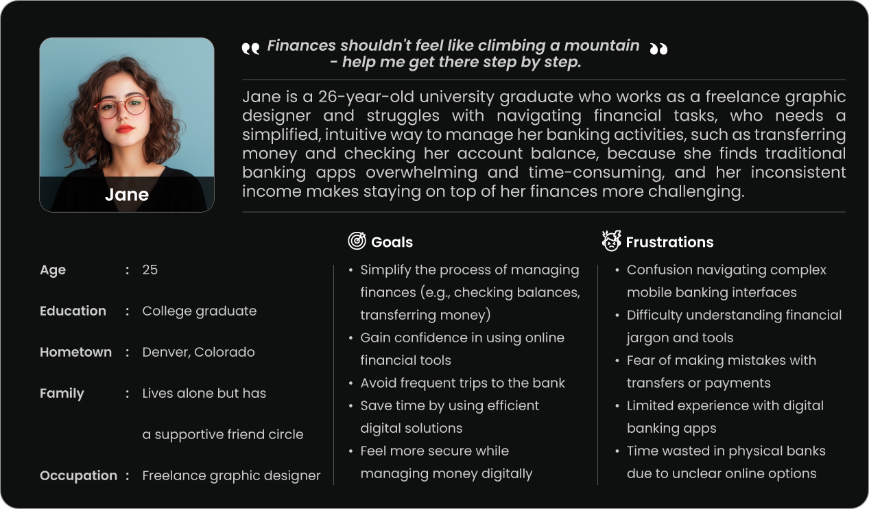
Created persona
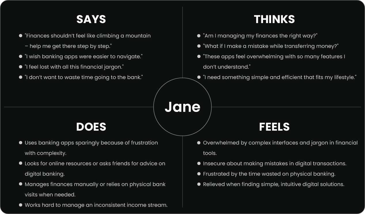
Developed empathy map
Mapped user journey
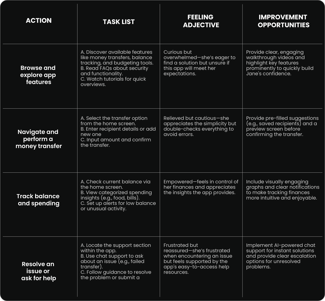
User Persona
Empathy Map
User Journey
Key Insight: Users need a simple, accessible app that streamlines essential tasks like money transfers and account management.
Define
User trust and security concerns
Accessibility for all users
Balancing simplicity with financial complexity
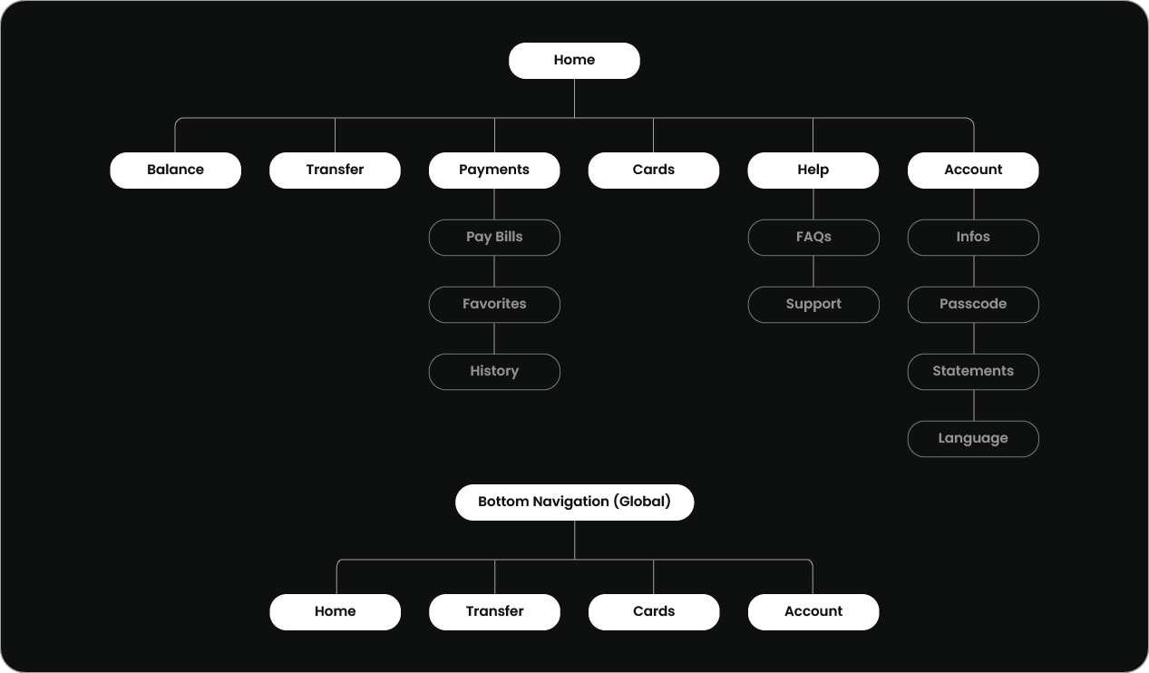
Information Architecture
Developed a sitemap to organize features (Home, Balance, Transfer, Payments, Cards, Help, Account) for clear, logical navigation.
Ideate
Design Principles:
Simplicity: Clean UI to reduce cognitive load
Accessibility: Inclusive design for all users
Personalization: Security settings and user preferences
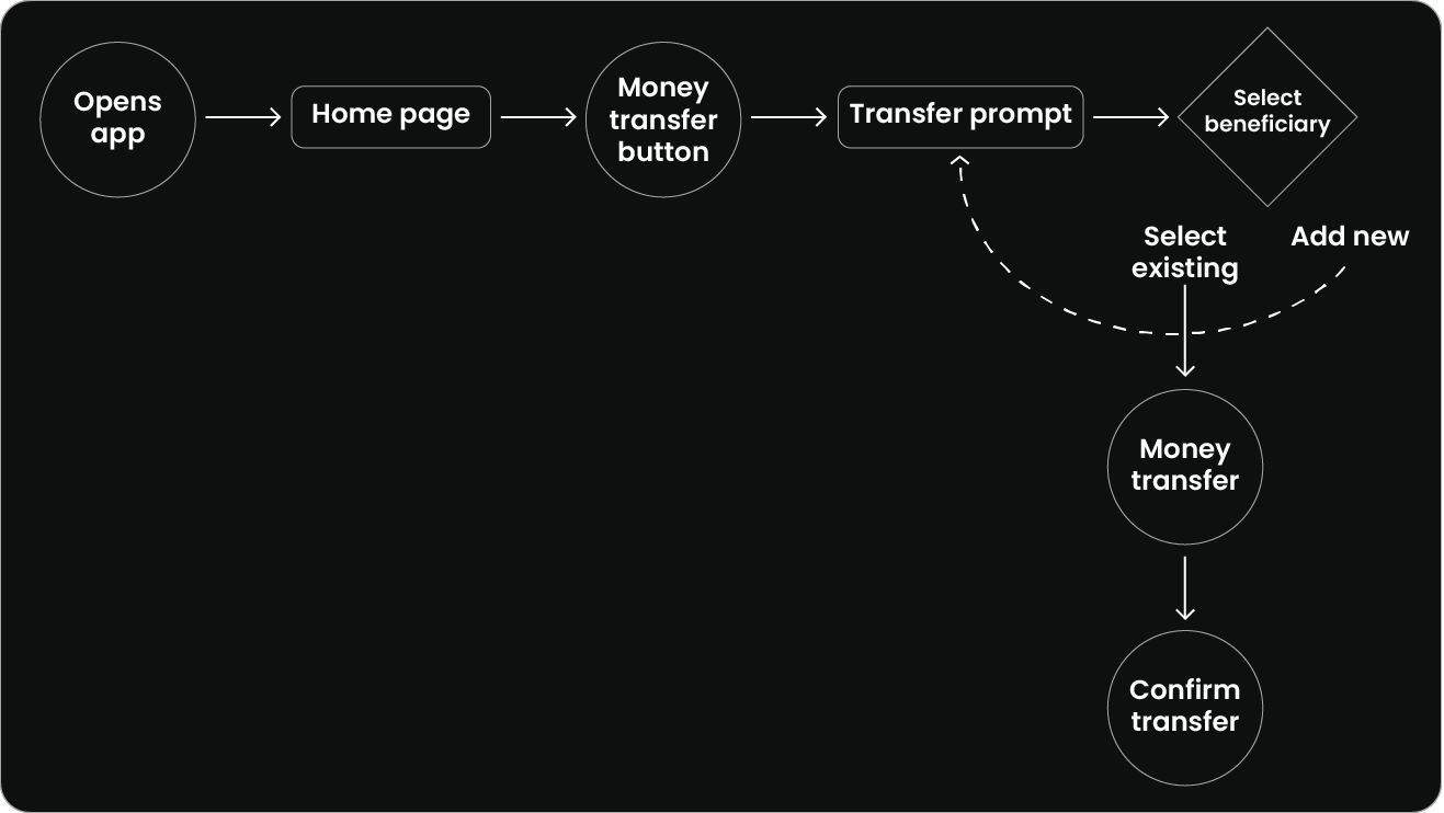
User Flow:
Mapped key tasks like money transfer to ensure smooth, intuitive flows
User Flow
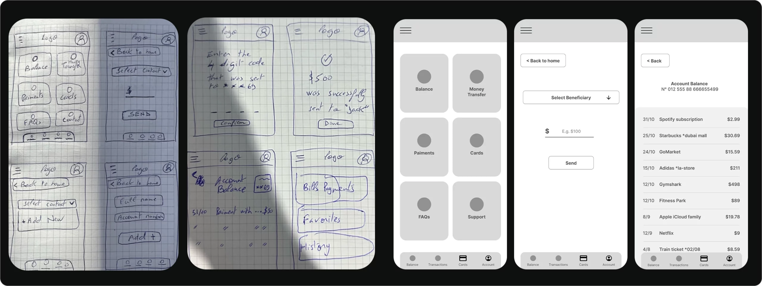
Paper wireframes and lo-fi prototypes to test screen structure and flow.
Translated paper wireframes into low-fidelity digital prototypes
Prototype & Test
Unmoderated Usability Study (Low-Fi):
5 participants tested money transfers, profile edits, and navigation
Findings:
Beneficiary dropdown unclear, some inactive fields, profile editing confusing
Actions:
Simplified dropdown, clarified form fields, improved profile navigation
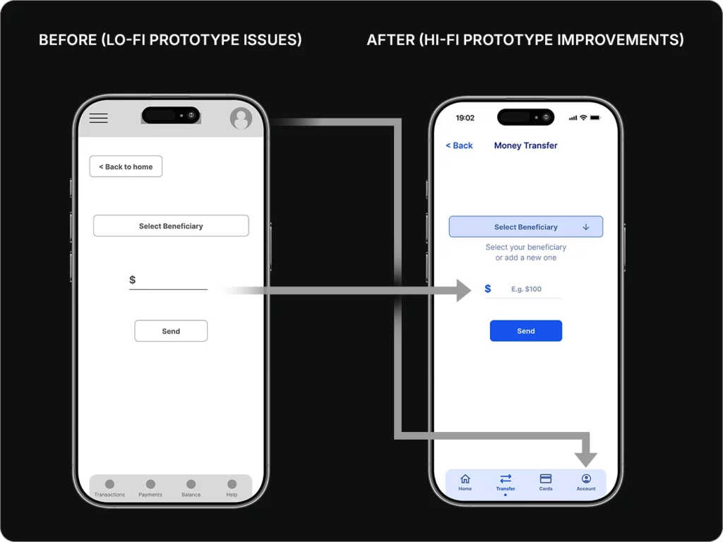
Before:
Users weren’t able to add the transfer amount
Profile/account page was hard to reach
After:
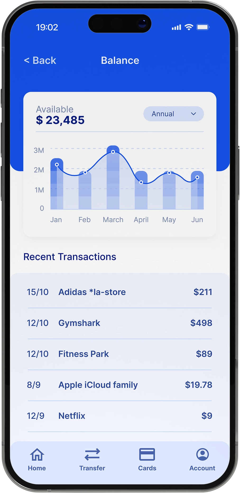
Transfer amount: Users can now easily add the amount to transfer
Account/Profile access: The account page was moved to the bottom navigation, making it easily reachable
Before & After
Issue: Limited Transfer Functionality & Difficult Account Access
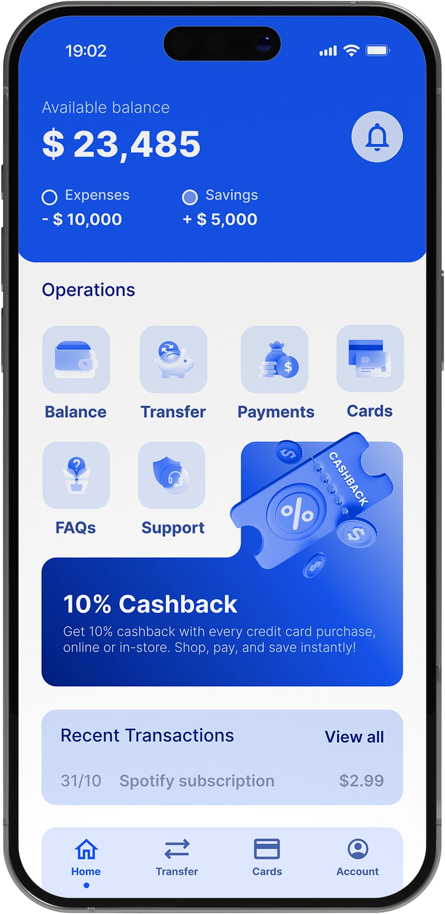
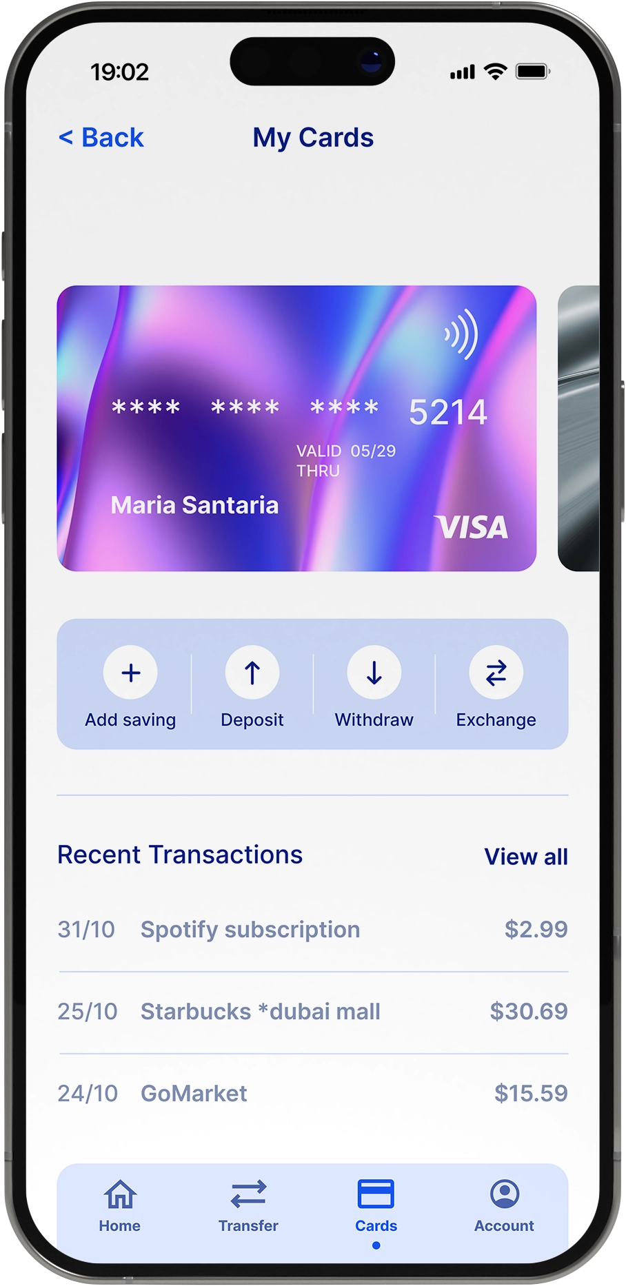
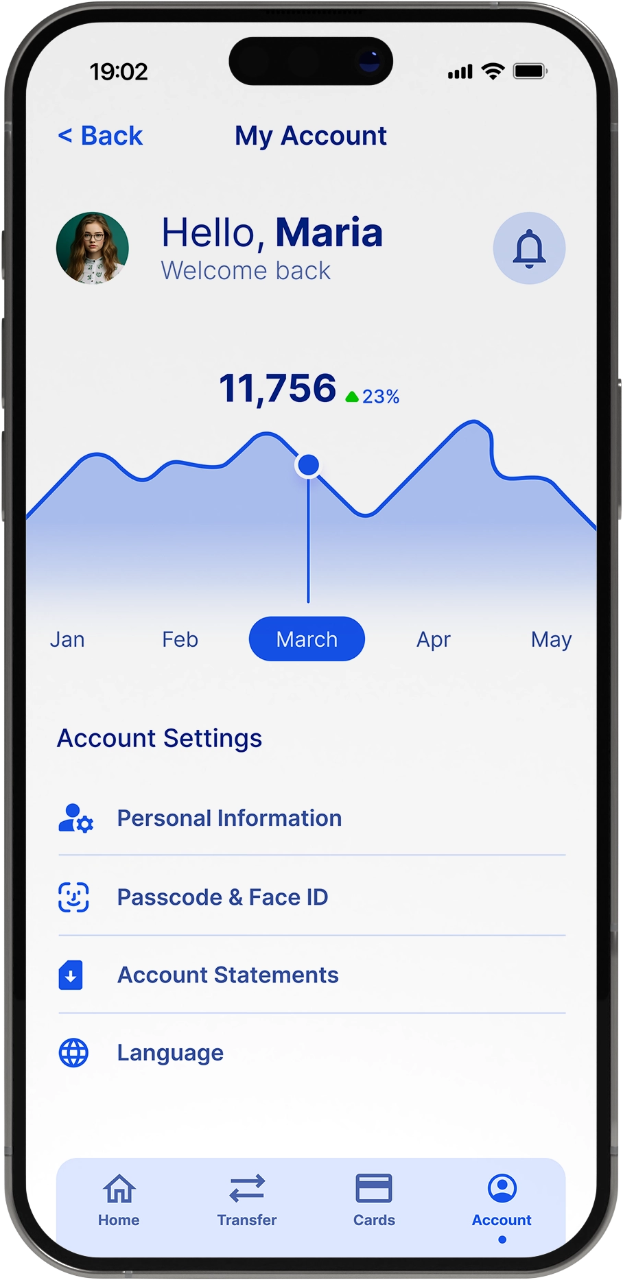
High-Fidelity Prototype:
Interactive design with improved bottom navigation, account access, and animations
Validated through moderated usability testing, showing smoother navigation and clear task completion
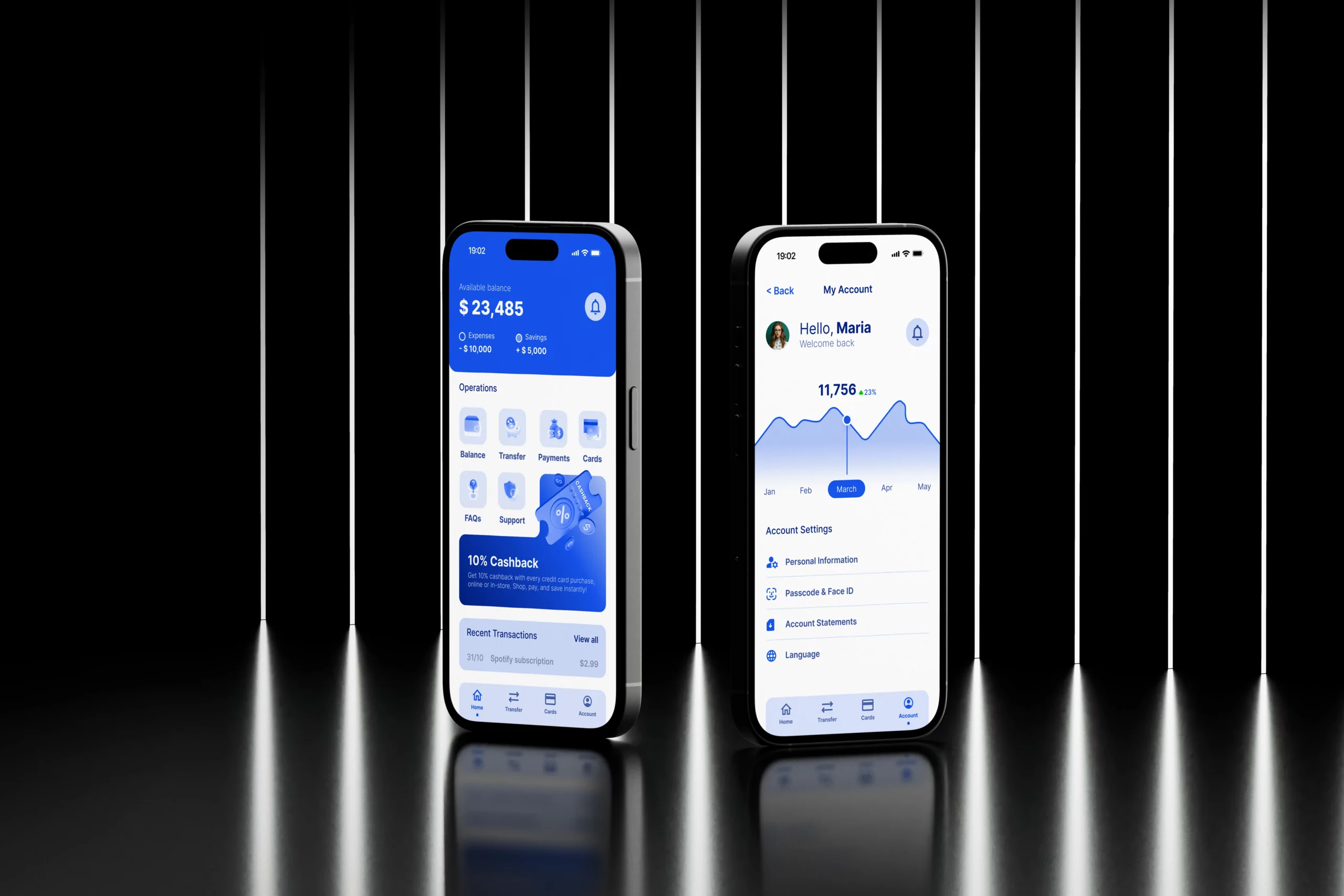
Home
Money Transfer
Cards
Account
Balance
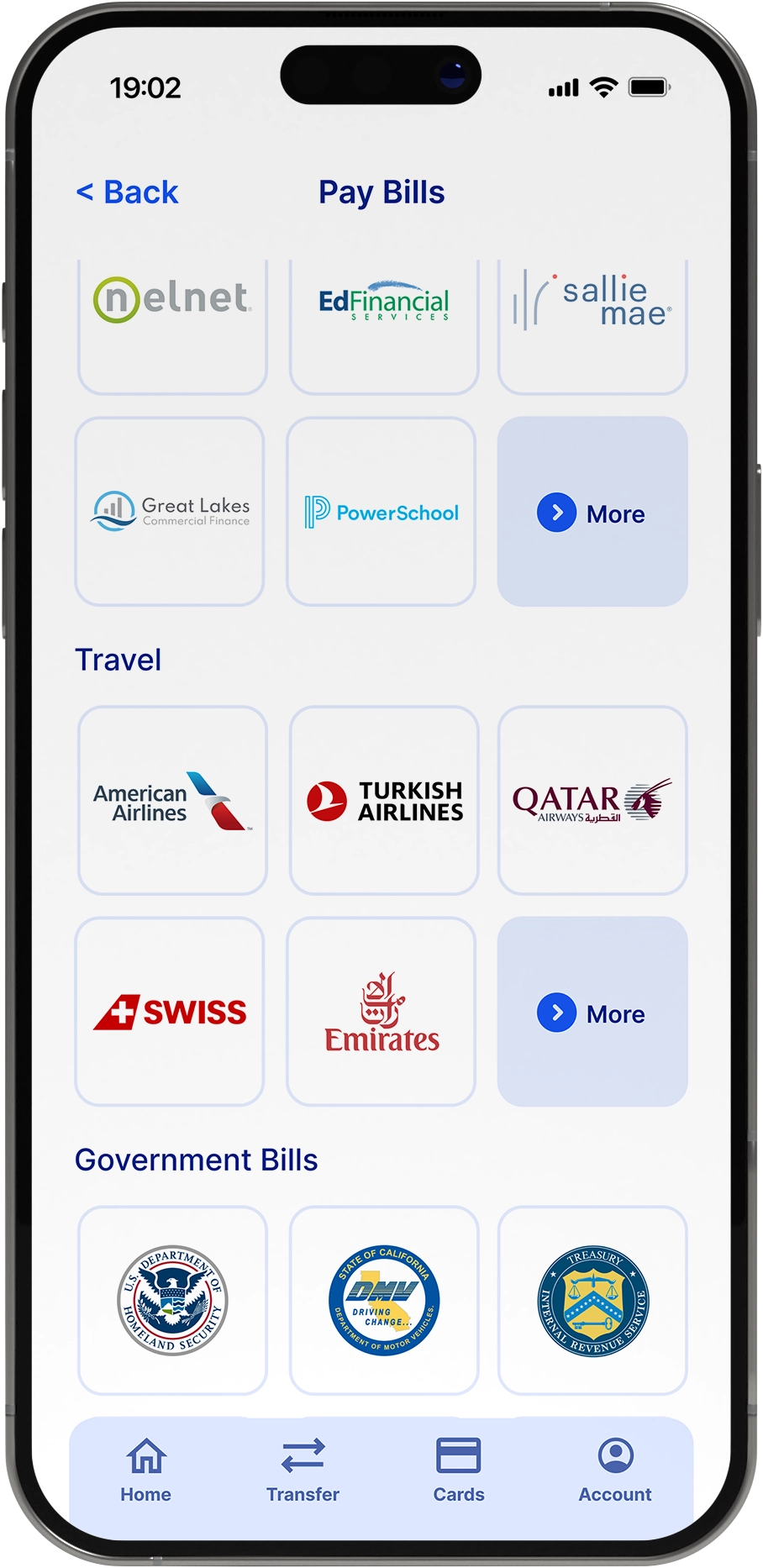
Pay Bills
Accessibility Considerations
While designing, I ensured the product was inclusive and aligned with accessibility best practices:
Gestures: Incorporated a swiping gesture, which is widely recognized and intuitive for most users.
Color Use: Applied the 60–30–20 rule for balanced visual hierarchy and readability.
Contrast: Achieved a contrast ratio of 5.91:1, which passes the WCAG 2.1 AA minimum requirement (4.5:1).
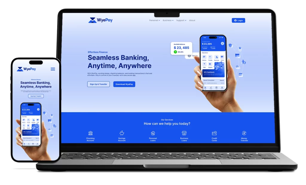
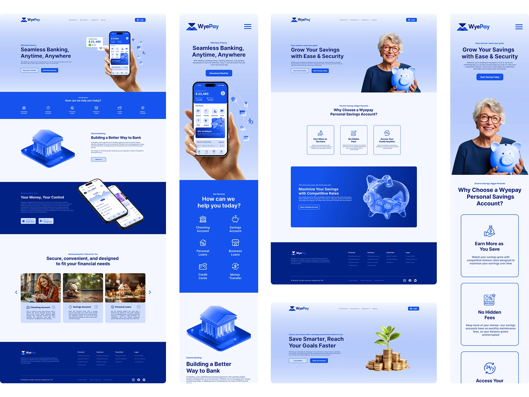
Website section
While I explored paper sketches and digital wireframes during the design process, this case study highlights the final high-fidelity prototype to best showcase the website experience.
Conclusion
WyePay demonstrates a full UX process from research to high-fidelity prototype. Key challenges like simplifying transfers, improving profile management, and refining navigation were addressed through iterative testing. The final design delivers a seamless, intuitive experience tailored to user needs.
Next Steps
Future iterations could include implementing customizable notifications, exploring advanced security features, and extending the design to additional platforms. Continuous user feedback and usability testing will ensure WyePay evolves with user needs.